
In times where trailblazing decisions are made based on data analysis, it is vital to identify important business-critical correlations and customer-specific data dependencies. In addition to its importance in everyday decision-making, this information also plays a significant role in the planning and implementation of digitization or data management initiatives. In our consultants’ experience, identifying these correlations usually requires manual table analyses to be performed or expensive licenses for third-party tools to be purchased. Furthermore, it is difficult to create a comprehensive overall view of the correlations between different data objects with existing means.
Camelot offers a solution that significantly reduces runtime and enables complete transparency for master data objects by analyzing related tables. The Camelot Data Assessment Tool not only analyzes the master data itself using modern algorithms, but also pulls in change data to analyze and visualize correlations.
Overall view of correlations in master data
To obtain a comprehensive overview of master data, it is important to know both the properties of the fields and the respective changes that have been made. For this purpose, the Camelot Data Assessment Tool analyzes change pointers that the system records on master data. This results in a list of frequently changed fields and values as well as an overview of users who edit defined business-critical fields. As an example, you could find out who regularly creates or changes bank details, which in turn would allow you to identify suitable stakeholders who could, for instance, define new approver positions in processes.
Table 1 shows an example where three users have made changes to the bank data. You can see that User_1 mainly creates new bank data and only changes it occasionally. User_2 mainly deletes bank data and User_3 only makes changes.
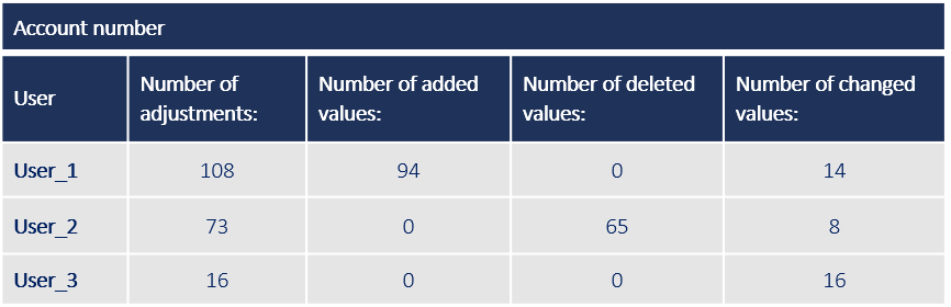 Table 1: Change data for the ‘bank account number’ field
Unlike change pointer analysis, examining master data tables provides an insight into the master data’s correlations as well as its distribution. To do this, the Camelot Data Assessment Tool calculates the filled status of table columns as well as the frequency of individual values. This function also has a grouping option that can be used to create frequency lists depending on related fields.
Table 2 shows an example of grouped frequency lists, in which the frequencies of the values for individual company codes’ payment terms are represented.
 Table 2: Frequency list company code & payment term
By combining the analysis of change pointers, grouped frequency lists and fill levels, an overall view of the master data’s correlations is created.
Design support thanks to rule mining
Rule mining describes the data analysis process in which correlations are established, e.g.: “If field A has a value of 1, field B has a value of 2 with a frequency of x%”. The Camelot Data Assessment Tool uses rule mining algorithms to examine both master data and change pointers for hidden dependencies. This differs from grouped frequency lists, in that larger number of fields can be examined at the same time and dependencies with too few occurrences can be intelligently filtered out.
An analysis using rule mining algorithms aims to identify previously hidden correlations in the data and then evaluate them. This enables new previously unconsidered business rules to be defined, which improves data quality in the long term. For example, the focus might not lie on which material is used in which factory, but rather on questions such as “Is there a type of material that is only used in one factory?” Once such a correlation is found, it can be used to validate data or automate maintenance processes.
Visualizing the results
The Camelot Data Assessment Tool offers the possibility of graphically displaying the analysis results. To do this, Camelot has developed a suitable graph that intelligently displays the rule mining results.
Figure 1 shows the analysis result between company code, payment term and control account. From a business perspective, such a correlation seems realistic, as different company codes (which can represent different companies, for example) use specific payment terms or can be assigned to specific reconciliation accounts.
The green dots represent individual fields, the yellow dots define independently found rules. The incoming arrows define the condition and values of the rule fields. In the example shown in Figure 1, the analysis identified four rules from the existing data, all of which are made up of different combinations of company code, payment term, and control account. It becomes clear that, for example, the combination of company code “S300 – Camelot ITLab GmbH” and payment term “ZB00 – Payable immediately” always leads to the control account “152000 – Third Camelot ITLab”. Furthermore, the combination of company code “1000 – CAMELOT Management Consultants” and payment term “ZB05 – Payable within 30 days” always extrapolates to control account “160000 – Third CAMELOT Management Consultants”.

Fig. 1: Network graph with associated rule table
Frequency analyses can be displayed as bar charts and tables, which can be filtered and exported as Excel or image files. Figure 2 shows the frequency table of supplier master data for the used payment methods. In the example we are focusing on here, you can see that around 600 of the entries have the combination of the values “check/bank transfer” maintained for the payment method.
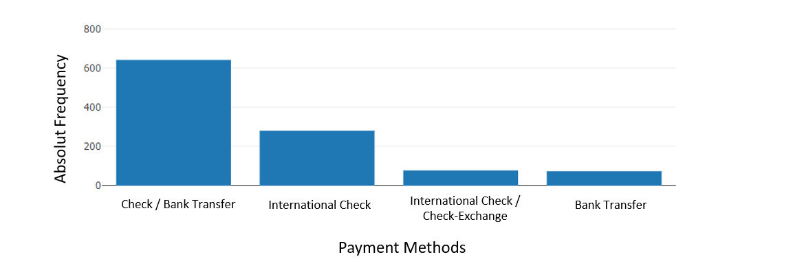
Fig. 2: Frequency distribution for the “payment methods” field
Detailed understanding of your data
The Camelot Data Assessment Tool is the ideal solution when it comes to analyzing and visualizing structures and hidden correlations within your data. The combination of various analysis options within the tool ensures that results are available in the shortest possible time. The application of rule mining algorithms additionally supports and refines the insights gained using this method. In addition, the results can be easily used for presentations and further processing using various visualization options.
If you would like to learn more about how you can refine your data analysis in addition to automating and accelerating it, please contact us.